

Cancer rates through the roof
Doing some research on seer.cancer.gov

Let me preface this with this note from the American Cancer Society:
Please note: The projected numbers of new cancer cases and deaths in 2022 should not be compared with previous years to track cancer trends because they are model-based and vary from year to year for reasons other than changes in cancer occurrence. Age-standardized incidence and death rates should be used to measure cancer trends. In addition, estimates for 2022 do not reflect the impact of the COVID-19 pandemic because they are based on incidence and mortality data reported through 2018 and 2019, respectively.
Based on this comment I may be completely off with my analysis below and would certainly defer to someone who fully understands how these numbers are determined and presented. I am just sharing published info from the NIH and ACS websites that I came across when researching as a result of a friend’s pancreatic cancer death and my anecdotal evidence and concern about increased cancer diagnoses. My interpretation of this data could certainly be incorrect and only time will tell, sadly, whether these cancers have increased as a result of COVID or the MRNA vaccines. -m
The SEER site has data on cancers and cancer deaths. After a close friend died a couple months ago from an out-of-nowhere stage 4 pancreatic cancer (that metastasized all over) I have had a passion for this. Then reviewing Steve Kirsch’s compilation and finding 36 deaths with nearly the exact same story I looked to the NIH’s Surveillance, Epidemiology, and End Results (SEER) Program, the “AUTHORITATIVE SOURCE FOR CANCER STATISTICS IN THE UNITED STATES”. I went to the pancreatic cancer page to see what the stats were and found this chart:

Wow, very consistent from 1992 to 2020. Wait, 2020? Thats not helping me with stats since the MRNA vaccinations started. But take a look at the 2022 estimated cancer deaths above. I could not find how they calculated the rate per 100,000, but the most conservative approach would be out of the total US population. The population in 2020 was 331 million, which would indicate a total number of deaths in 2020 of 11 (per 100k) x 3,310 people (per 100k) or 36,410. Compared to a 2022 estimate of 49,830! Thats a 37% increase for a cancer that has been straight-line consistent for at least three DECADES. The estimated death rate for 2022 would be 15.0 and the chart would look something like this (chart by me, not the NIH’s National Cancer Institute):
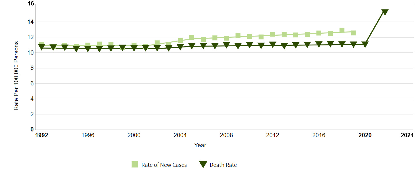
That is the very definition of an anomaly “something different, abnormal, peculiar, or not easily classified”. They can only leave the charts un-updated for so long. And what happened in 2021 and 2020 that didn’t happen in 2020? Lockdowns? No, pancreatic cancer is not one that is screened for and is so aggressive that those deaths would have shown up in 2020 if it was due to the lockdowns. I cannot think of any other explanation. Does it mean everyone is going to die from pancreatic cancer? No, I don’t think so. Does it mean that there was a massive uptick in pancreatic cancer deaths after the vaccination campaign started? Yes, definitely.
Adolescent and Young Adult Cancers
I decided to take a look at cancer deaths overall as well, for all types, but there is no data more recent than 2019 for *all cancers* that I can find. Digging in again they do have a page for Cancer Among Adolescents and Young Adults (AYAs) (Ages 15–39) If we dig into that a bit it shows the following chart:

The most recent observed rate is 2019 at 73.78 cases per 100k. They estimate new cancers in this age group for 2022 to be 87,050.

Based on population figures here, I am able to determine that the 18-39yo age group represents 29.52% of the US population or about 97.5 million people. That gives us a projected 2022 rate of new cancers in this age group of (87,050/975) 89.28 for 2022. Again, this is a 21% increase in cancers that have been very stable (ranging from 62 to 76) over the last 28 years. I’m not going to photoshop another chart but you get the drift. This is unheard of.
American Cancer Society
Why is the American Cancer Society (ACS) not jumping up and down about this? Are they? If so I haven’t seen it. Looking at their statistics page they claim:

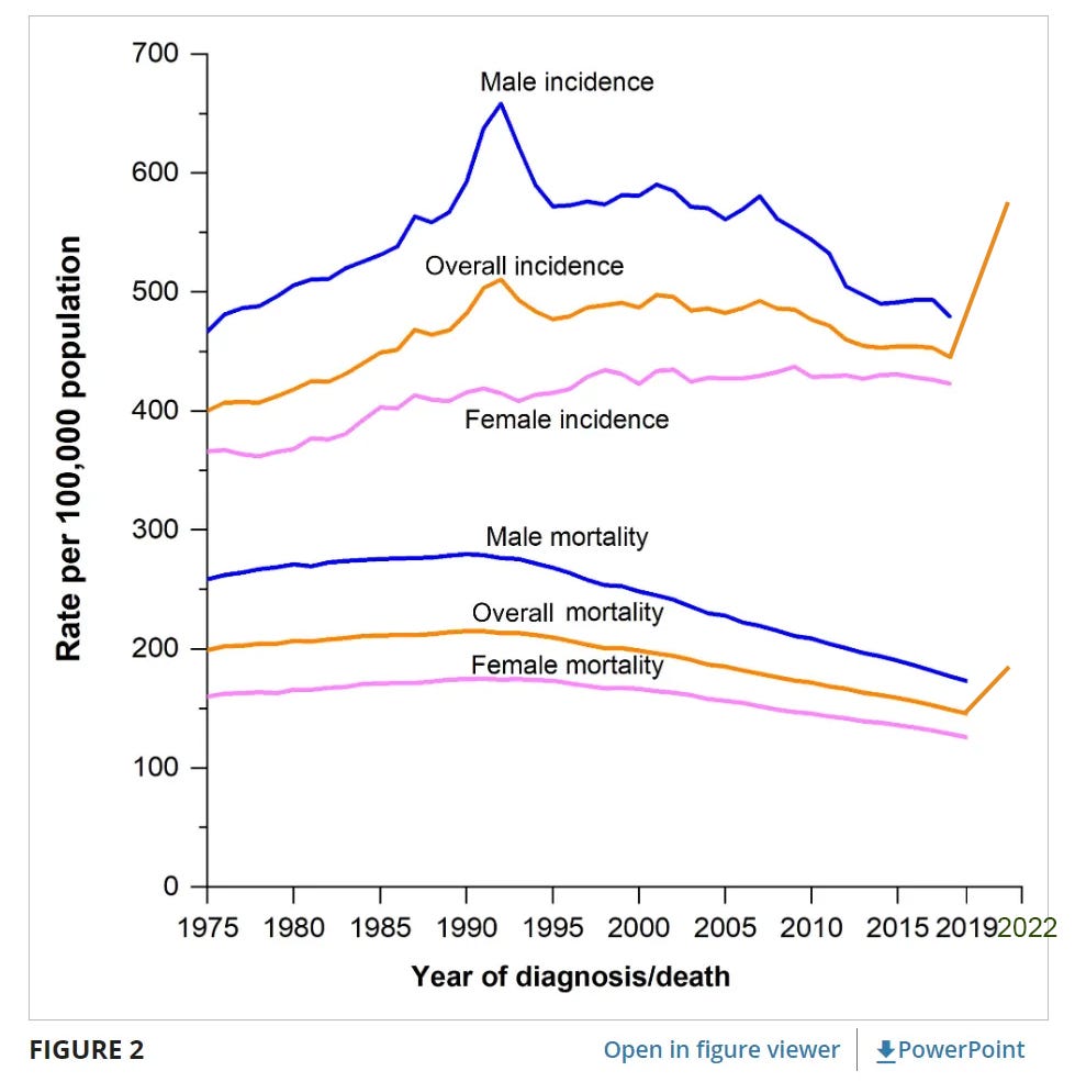
But, and it’s a big but, that is for data through 2019. Really? A 2022 article using 2019 data? In their Cancer statistics, 2022 they share charts like this:

…but again, only through 2019. BUT they do share their projections for 2022 on the same page and the expected incidence of new cancers is 1,918,030 or 576 per 100,000 (see below). As can be seen in the chart above the most recent data (2019) is about 440 for 2019. Mortality below is estimated at 183/100,000, compared to the 2019 rate of about 140.

The chart adding the 2022 estimates would look something like this:
Conclusion
I guess the conclusion is that though we seem to be having an explosion of cancers (possibly filling hospitals and causing excess deaths), and though the NIH and Cancer Society fully recognize it in their predictions and estiamtes, they have not yet fully acknowledged it and not publishing it in on their dated charts and graphs. Just to check, I used the wayback machine to see how the reporting was on the same day in 2019 for young adult cancers. When I did, I got this odd header (why get this when searching on young adult cancers?):

Anway, the charts and graphs do not show up, so three-year trailing data may be the norm, which begs the greater question, why are the experts predicting a 37% increase in pancreatic cancer, a 31% increase in all cancers, and a 21% increase for all cancers in the 18-39 age group for 2022? In the future this *could* be damning evidence of MRNA causing cancers, especially as 2020 seems to be following the trend.
Note: I am not a statistician, not a doctor or health professional, and not an expert in these government or cancer websites. I could certainly be completely off with all of this and would welcome any criticism. In fact, I hope this is wrong. I am just a concerned citizen who lost a close friend this year and am researching the questions that have arisen from that experience. If anyone else more qualified would like to take this and run with it, please do.
Also I do not understand how SEER calculates "age-adjusted death rate per 100,000"
Sadly we have "age-adjusted rates" up to 2019 and "cases" in 2022, this may present a problem as this is not apples to apples?
Any idea how to overcome it?
I find your post to be very interesting. So please do not take my comments as something negative -- I want to make sure every number is defensible.
you have a typo "steve hirsch"
I do not understand logic and calculations of this paragraph:
Based on population figures here, I am able to determine that the 18-39yo age group represents 29.52% of the US population or about 97.5 million people. That gives us a projected 2022 rate of new cancers in this age group of (87,050/925) 89.28 for 2022. Again, this is a 21% increase in cancers that have been very stable (ranging from 62 to 76) over the last 28 years. I’m not going to photoshop another chart but you get the drift. This is unheard of.
I think that you have something real here. If I write about it I will definitely refer to you in a big rectangle link